


With the advent of social media, marketing has reached a fever pitch it its ability to connect consumers with companies, but what is often the struggle is how to effectively translate a business story to a cohesive, catching, and credible message to potential clients.
That’s where business-mantra interpreter extraordinaire, Bradley Richtman, of Bay Shore, comes in to work his marketing magic.
One of his most recent clients, a local eatery that has generated quite the buzz on the South Shore culinary scene, Islip’s Rock City Dogs, had a cool concept of ‘70s rock combined with equally edgy burgers and hot dogs.
“For me, the logo or the look is just a starting point; the marketing materials we put it on and the whole suite of products is where I shine and where the connections to consumers are really made,” said Richtman.
“For them, I wanted to make the marketing materials of the restaurant a theatrical experience to be in line with the drama of ‘70s rock that they were all about,” said Richtman.
The menu, based off a ‘70s vinyl LP, took weeks of collaboration with the owners of Rock City Dogs, as Richtman wanted it to invoke simplicity, fun, and edginess.
Even the T-shirts Richtman selected for merchandise are specifically from the ‘70s, with their characteristic white stripes on the arms.
With a solid eight years of experience in graphic design, digital and merchandise marketing, Richtman, has made it his life’s work to properly and fully convey a business’s story to its consumers.
“When I get a new client, I go through a gamut of questions to really get to know the company and the people who lead it,” said Richtman. “From there, I go to see what translates into design material. It’s really about the company’s goal in business gain of new customers.”
Richtman’s prowess comes in with developing enveloping color schemes and graphic representations of his clients’ background and vision.
“Even if you have a straight-forward, corporate type of business, if the CEO is an eccentric personality, that all needs to be captured in the logo and the marketing materials that we come out with,” said Richtman.
Even personal questions are asked during the design process, as Richtman delves deep into the psyche of a business to fully capture their message before bringing it forth to potential customers.
For most of his career, Richtman was a go-to person for marketing materials for Fortune 500 companies, starting with his work at Staples as a consultant for businesses looking for design work.
The diversity of Richtman’s clients is a testament to his skill and all-around alacrity, as he has produced logos and marketing materials for staid law firms, sprawling but specific construction companies, and artist-driven businesses.
“Especially since the pandemic, social media has grown and many companies see the value in reaching their potential client base through Facebook and Instagram,” said Richtman. “But they also realize that this means having a recognizable, cohesive, and consistent message and branding.”
According to Richtman, it takes six or seven “touch points” for a consumer to remember a brand. These touch points include hearing about the brand on the radio, seeing a Facebook advertisement about the brand, or a television commercial about the brand.
“If your message is diluted or confusing, then you’re not reaching or sticking in the consumer’s mind, and it’s wasted,” said Richtman.
With Keith Haring as one of Richtman’s visual idols, his graphic design of logos is developed and contingent on the simplicity of a look with a concise message.
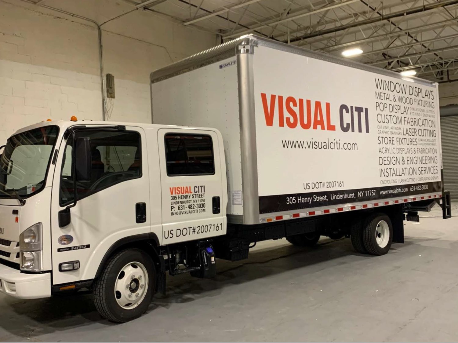
For one client who specialized in window displays and installation efforts, Richtman redesigned their truck markings to be a graphic made up of words instead of the image-heavy idea they originally had.
“Again, it was about translating that message. Their potential clients needed to know what they could do for them, so we listed it out on their trucks. I chose a simple, contemporary font which works like the gallery white walls to really showcase what they can do for their clients’ businesses,” said Richtman.
What is evident throughout Richtman’s work is his devotion to growing a company and seeing their marketing and branding beyond a business card to something that stays in the consciousness of consumers.
Please visit www.bradleyrichtman.com for more graphic design and marketing tools.


Comments
No comments on this item Please log in to comment by clicking here